I already showed you a sneak of our living room makeover, but obviously I have a lot more to show you. Today is part 1 on the blog, our sitting area.
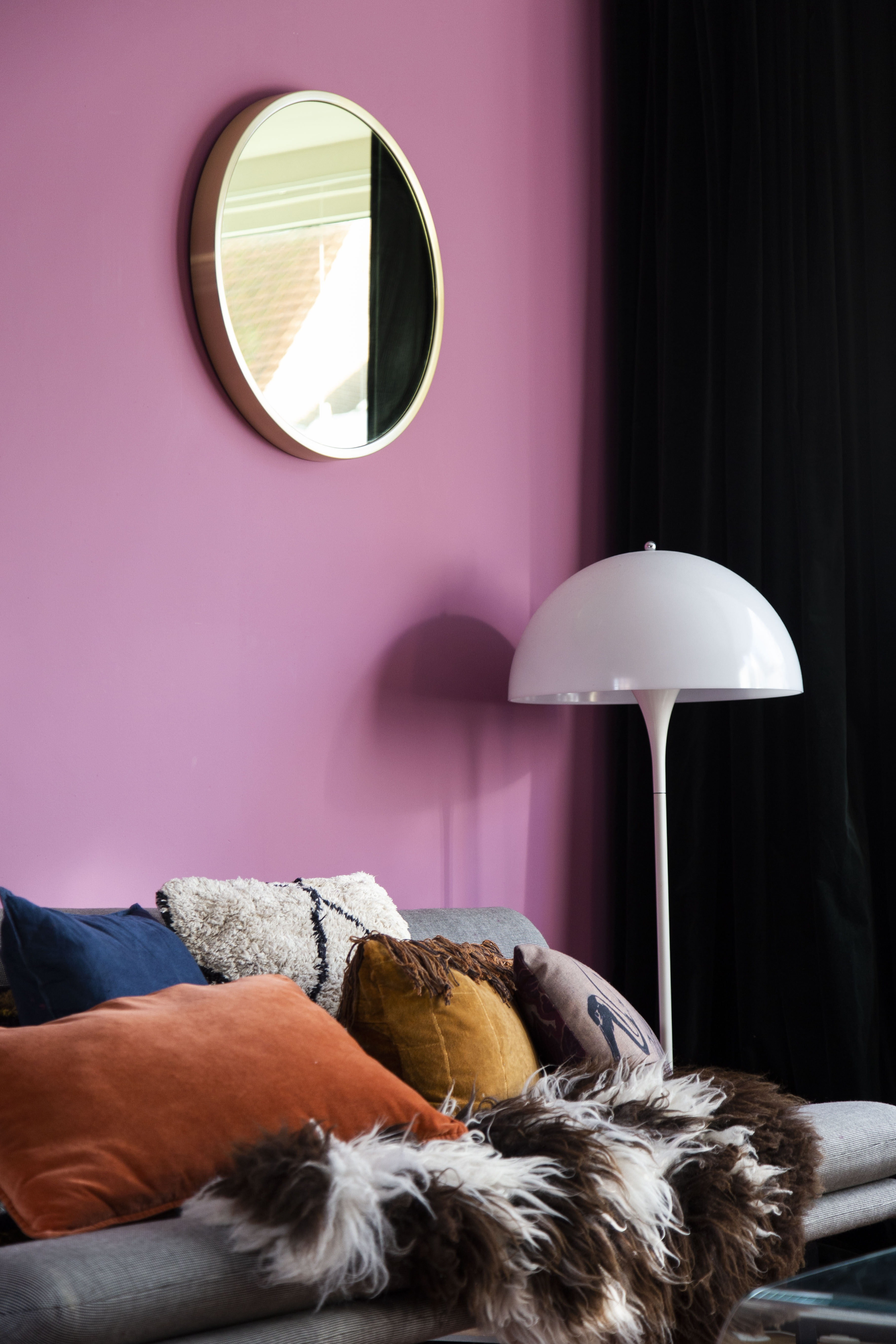
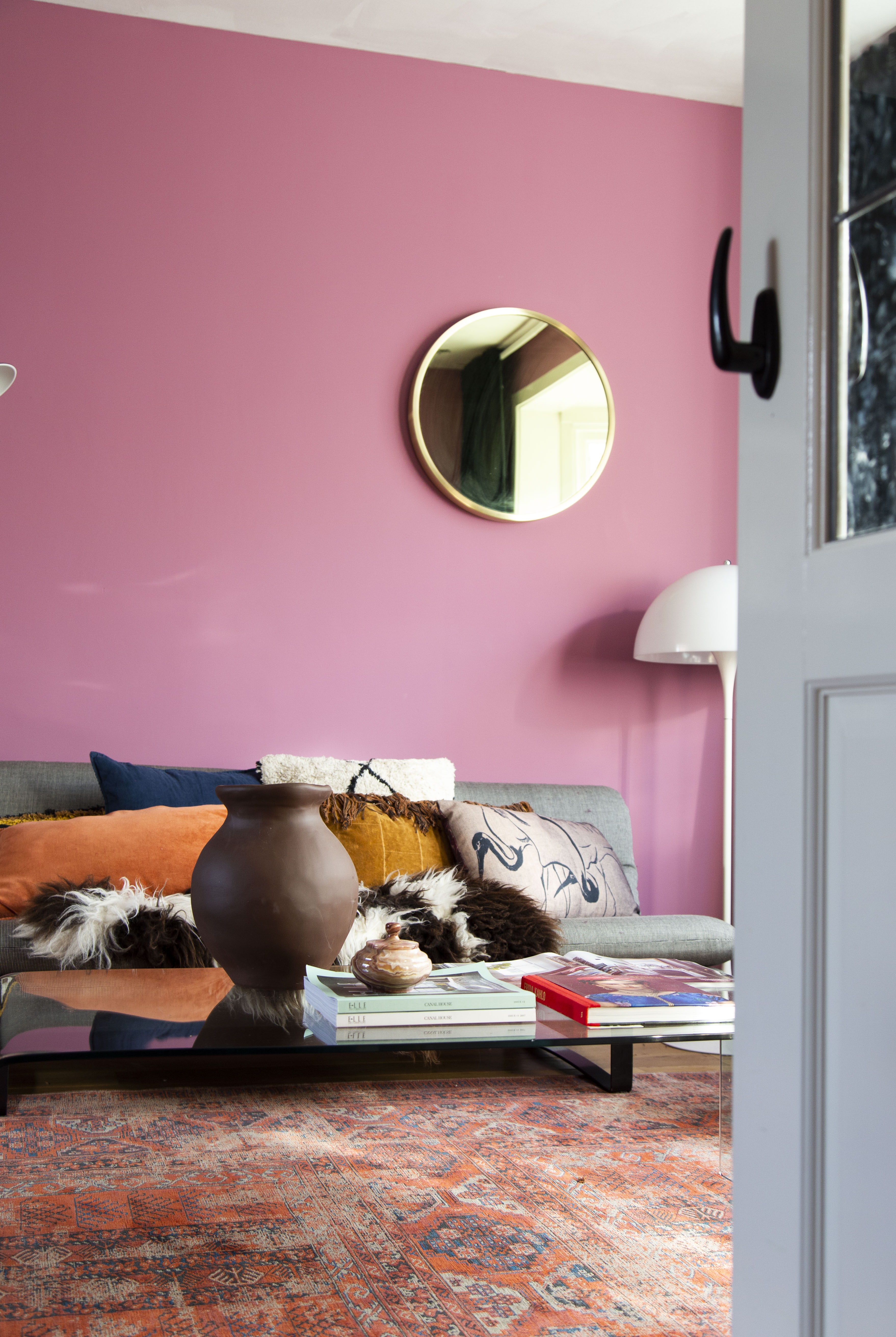
The color I chose is Rangwali by Farrow & Ball and as I said in the sneak preview, it was love at first sight. Such a bright, happy color but at the same time a matte finish I loved immediately. I am a huge fan of Farrow & Ball and I use them for my interior advices a lot as well. I have used their paint a few times before but I will admit this was the one I was most nervous about. We went from a nude pink to this vibrant one and I was so curious to see what it would look like and yes, a little anxious as well. But now that it’s finished I can honestly say I love the end result and if we’re being real here; isn’t this bright color the best way to start this grey fall weather we have now? Enough chatting, let’s see some pictures!


For the first time we decided that we would also paint the walls in the bay window. I really didn’t like it when they were still white, but we kept it like this because we knew we wanted to change color some day. Now it’s finally all color on 4 walls and the effect is so good. Now the color hugs you from all places, if you don’t mind my figure of speech.
You can see what it looked like before HERE. The wall behind the couch was Studio Green, also by Farrow & Ball. Our fireplace is Off Black, also F&B.
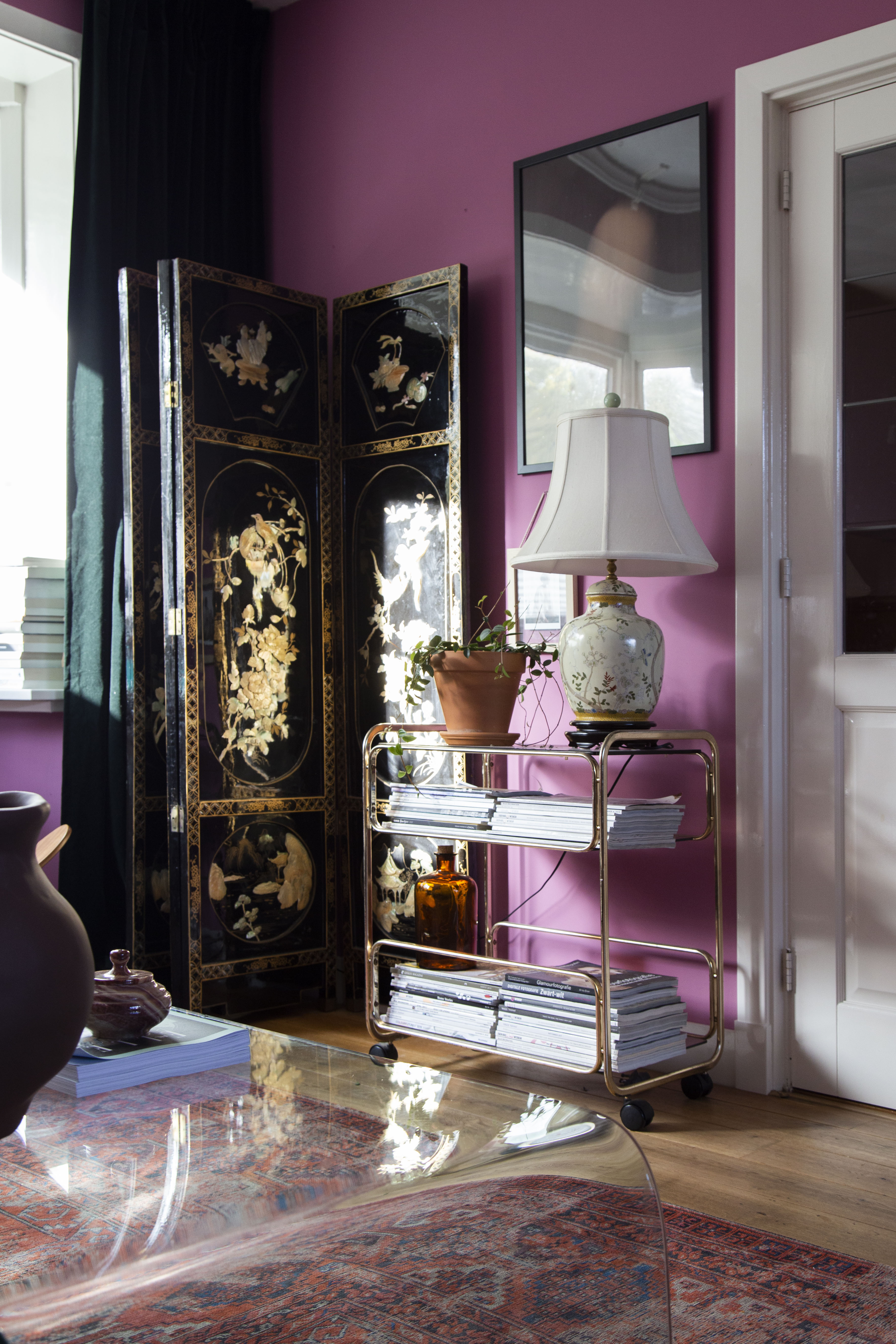

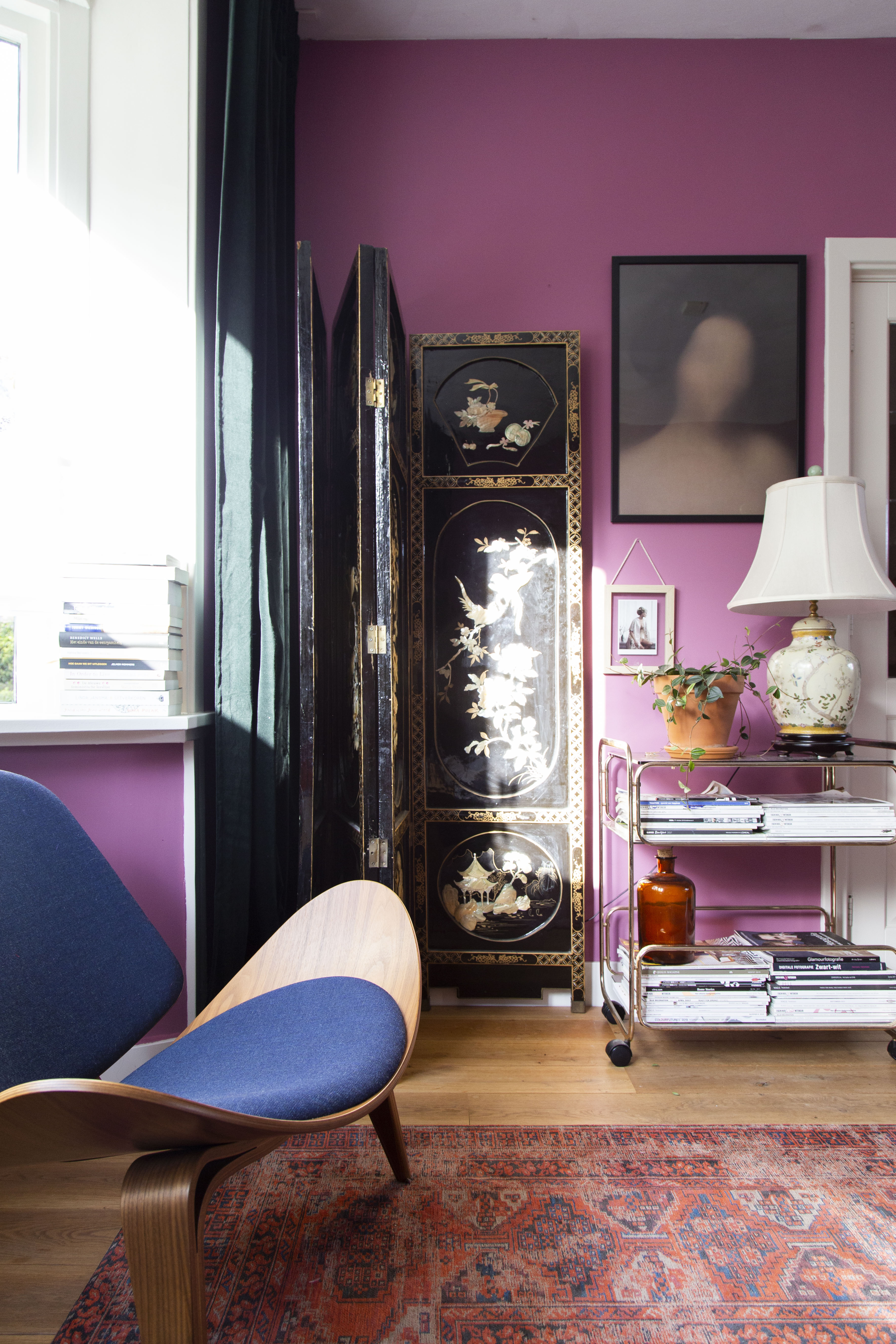
Facing the couch is my favorite styling corner. This vintage Chinese room divider I love, combined with this vintage Chinese lamp. Now these items pop even more with Rangwali on the walls.

Our sitting area is now a mix of colors and I love it. Rangwali on the walls, colored pillows, a vintage-inspired rug and all these colors combined with personal items and pieces we collected over the years.
As my husband pointed out, this bright Rangwali on the walls really made our furniture stand out. An effect we both love.
As I said before, this color to me was love at first sight. I do however always state that you should never buy paint off a photo, and always test them on your own walls. The end result of a color will depend on so many aspects; your floor, the amount of light in your house, and which wall you’ll paint with it. In our case we have a very warm-colored floor, so I usually find that wall colors with a cool undertone work best to even it out. Our livingroom is facing the South, so that usually gets a lot of sun during the day. The dining area that I’ll show you later on the blog, is facing the North so there the color will look a lot cooler. I’ll give you an example with the photos below:


As you can see, there is a big difference in what the color looks like. This is why I’m a big fan of Farrow & Ball sample pots. I bought one of those to test the color on our walls. I used a piece of wall behind a frame so we could hide it whenever we wanted to. Absolutely the best way to see what a paint color looks like on your walls, so I really recommend those.

Now that you’ve seen a lot of our sitting area, I’ll save our dining area for next week. So keep an eye out on the blog!
Thanks for reading,
Love, Marrit
PS. This paint was gifted to me by Farrow & Ball. I only work with brands I love ♥
